Showing posts with label setting design. Show all posts

Thursday, 30 April 2020

Customizing Stock Art


Originals here and here.
As I've mentioned in the past, it can often be difficult to find stock artwork that matches your specific needs. However, commissioning lots of custom art can rapidly become expensive. That is why I like to "cheat," by selecting the stock art first, and then designing various monsters and adventures around it. Unfortunately, that isn't always an option.

Two days ago I released The Gobfather, a new crossover mini-setting for Saga of the Goblin Horde and Wiseguys, and for this product my normal approach of choosing the artwork first simply wasn't an option -- I needed a whole load of goblin gangsters, and I couldn't actually find any matching stock art. Nor could I afford to commission custom illustrations.

So I took my "cheating" to a whole new level: I chopped up a selection of different stock art images, resized and recolored them, and then I stuck the various pieces back together, creating my own unique illustrations. I used Photoshop, but you could just as easily use GIMP, or some another image editor. 

I decided to use artwork by Rick Hershey of Fat Goblin Games for my customized illustrations, for several reasons.

Original here.
First, Rick has an absolutely huge selection of very reasonably priced artwork to choose from, and when combining images it's essential they all have exactly the same style.

Second, the Fat Goblin Games license is very generous in terms of what you can do with the art (many artists don't allow you to modify their artwork at all, let alone chop them into pieces and reassemble them).

Third, I find the artistic style Rick uses easy to modify. I think this is mostly due to the black outlines, and a comic book style that tends to be more forgiving of minor mistakes.

Finally, of course, Rick draws lots of goblins! That's actually why I used so much of his art in Saga of the Goblin Horde, and it was nice to keep the same artistic look in The Gobfather.

To modify an image, I first duplicate the layer, then I zoom in and start cutting away the parts I don't want. I'll do this several times so that different parts of the image are in separate layers -- I might have one layer for the eyes, another for the mouth, another for the hands, and so on.

Originals here and here.
If the image has a thick black outline, I'll select that with the magic wand and copy it to the top layer, as it'll often help conceal minor discrepancies in the lower layers caused by cutting.

Not every part of the image needs to be cut cleanly, only those that will be visible in the final image. For example, I didn't usually pay much attention to the necks, because I knew I'd place a large goblin head over the top.

However, when images are combined, it's important they match up exactly. That means a clean edge on any parts of the image that will be visible, with the new component precisely rotated and resized to match the main image.

You can also use a fade-to-transparent effect to overlap two images (such as when I placed a new nose on Don Bignose's face). Other images should have a slight overlap, to avoid a gap between them -- for example, when I added Chip Chop's head, I placed it behind the suit collar and then cut away the suit.

This approach is also very convenient for changing colors, as it means that (for example) I can make the skin green without changing the color of the clothing, or darken the suit without changing the brightness of the steel knife.

Changing the proportions of an image is something that should be handled with great care, and I try to avoid this whenever possible. I did do it for one of the goblins, as I needed to turn a tall thin crime boss into a short goblin -- but I removed his hands first, replacing one with a larger duplicate of the original hand that also kept the original proportions, and the other with a goblin hand from another image.

Summary

While I don't have the skill to create my own art from scratch, it wasn't too hard to modify existing images, and I think the results were pretty good. This process obviously requires a fair amount of time, so if you can afford to commission custom art, that's still the better option. But if you're on a shoestring budget, and can't find the exact stock art you need, this is definitely a viable alternative.

All of the artwork in this blog post is by Rick Hershey. Publisher’s Choice Quality Stock Art © Rick Hershey / Fat Goblin Games (www.fatgoblingames.com).

Wednesday, 25 September 2019

Savage Worlds: Pricing your SWAG

The Savage Worlds Adventurer’s Guild (SWAG) launched at the beginning of this year, and there have already been dozens of products released through the program, as well as a rapidly growing community of designers on the unofficial Savage Worlds Discord server. But one area that many people seem unsure about is pricing, so I thought it would be interesting to take a look through the SWAG releases and get a rough idea of their price/page ratio, much like I did for licensee products a few years ago.

It must be stressed that these figures have very limited value when viewed in isolation, because many other factors come into play -- the page size, the font and layout, the amount of artwork, the utility and complexity of the product, and so on. However, when combined and averaged, these figures can at least give you a feel for the sort of price range SWAG products typically sell for, and by comparing your product with other products of similar size and content, you can get an idea of what customers are willing to pay.

I should also stress that this post is not intended as a criticism of other people's pricing! There's quite a lot of variation between publishers, and I think that's great because it allows us to compare and optimize our strategies. In time, I imagine we'll see products start to align more closely in terms of price -- but SWAG is still relatively young, and it'll take time to establish a set of norms.


The 65 SWAG products listed above have a total of 787 pages for $122.71, which averages out at $0.16 per page. However, this figure is somewhat distorted by the larger PDFs, where the price/page is usually much lower. If we ignore the 5 highest and 5 lowest priced products, the average comes to $0.21 per page. Ignoring the 10 highest/lowest gives $0.27 per page, and ignoring the 20 highest/lowest gives $0.34 per page.

Note: I didn't include my Wild West Countdown Deck in the above list, as I price decks differently from books. Print-on-demand action decks typically sell for $10-$15, and I sell mine for $12. I sell the print-it-yourself PDF version for $3. More information about designing and selling decks can be found here.

My Pricing Strategy

My own approach to SWAG pricing has been to pick a nice round number that falls in the range of 10-20 cents per page, not counting the cover, credits, or table of contents. In the case of my Fantasy Archetypes, I also didn't count the duplicated pages (each character had a male and female illustration on a separate page, but the text was practically identical for both versions).

For larger books, I'd gradually reduce the price per page, to a minimum of around 5-10 cents per page. So for a 150-page setting book, for example, I'd be probably aiming for something in the range $7.50-$15.00 (most likely $10, that seems to be a sweet spot for many people).

Of course, I'm still trying to get a feel for different pricing and marketing strategies, so I may well end up changing my mind in a few months. But at least this gives me a rough figure to work with.

Free, PWYW, Pseudo-PWYW and Fixed Pricing

I've released a lot of free products in the past, as well as a couple of Pay-What-You-Want (PWYW) products. But over the last few months, someone has been vote-bombing all the free and PWYW products on DTRPG, damaging publisher ratings and pushing free/PWYW products down the search lists, so I've moved over to fixed pricing.

There is a middle ground though, something I keep meaning to try -- you can give a product a fixed price, but also upload the full PDF as a "custom preview", then in the product description invite people to download it for free or pay a dollar if they like it. Only those who choose to pay will be able to rate or review the product.

However, the most effective approach does seem to be a fixed price, and the SWAG guidelines even give some suggestions, noting that "the most successful price points are $1.00, $2.00, $2.95, $3.95, $4.99, $7.95, $10.00, $14.95, and $19.99."

Best Seller Medals and Hottest SWAG Titles

You may have noticed some SWAG products have a medal. These are awarded based on the total number of sales (including PWYW, as long as the customer paid at least 1 cent). It doesn't matter how much the customer paid, only that they paid something, so free downloads don't count. Note that an order containing multiple copies of a product only counts as one sale.
Copper Medal: 51+ sales.
Silver Medal: 101+ sales.
Electrum Medal: 251+ sales.
Gold Medal: 501+ sales.
Platinum Medal: 1001+ sales.
Mithril Medal: 2501+ sales.
Adamantine Medal: 5001+ sales.
By contrast, the "Hottest" lists are based on how much money your products have earned over time (based on the date they were first made public). This is why newer products tend to jump to the front of the hottest list, and then gradually slide back down. Whereas cheaper product might make more sales (and thus earn a higher medal), expensive products tend to do better in the Hottest list.

Friday, 30 November 2018

Designing and Selling Custom Decks of Cards

Thematic Action Decks are very popular within the Savage Worlds community, and several publishers offer custom decks tailored to their own settings. There are even decks with specialized features, such as the Mutation Deck by Just Insert Imagination, or the Hellfrost Action Deck by Triple Ace Games.


The new Chase rules in the upcoming Savage Worlds Adventurer's Edition also require a second Action Deck, and it wouldn't surprise me to see publishers introducing new decks with special features for Chases. Pinnacle has released a preview of the Chase rules here.

While it's already possible to create your own Action Decks (like I did with my Countdown Decks), once the Savage Worlds Adventurer's Guild (SWAG) goes live, we'll also be able to publish decks that explicitly reference the Savage Worlds system. This will include Adventure Decks, equipment cards, NPC cards, decks with special rules (like the aforementioned Mutation Deck), and so on.

Getting Started

OneBookShelf (OBS) provide a lot of information about printing your own cards, including specs, tutorials, and templates for InDesign and Scribus. Take a look here for the details, and pay particular attention to this page.

As well as poker cards, you can also print (smaller) bridge cards and (larger) tarot cards. The same approach can be used for printing tiles and poster maps.

Designing your Cards

You can use image-editing software like Photoshop or GIMP to design the cards themselves. If your cards have text, some people will recommend adding that with your desktop publishing program (i.e., Scribus or InDesign) -- however I personally like to create the entire card as a single image, as this makes it much easier to offer print-and-play and Virtual TableTop (VTT) versions of my cards as well. It also means I can use a standard Scribus template to rapidly generate a new deck.

Usually, playing cards only have portrait illustrations on the face cards (king, queen, and jack) and jokers. Some Savage Worlds rules explicitly reference "face cards," so it may also make it easier for the players if you follow this standard. On the other hand, if you can afford sufficient artwork, some players really enjoy having a unique illustration on every card!

Development Costs

The artwork is probably going to be your main expense when producing a deck of illustrated cards. If you already have plenty of artwork for your setting book, then you can reuse it for your cards -- but if you have to commission a full set of artwork just for the deck, it could take hundreds of sales to recoup your expenses, and the market for custom decks simply isn't that big. Even if you're buying stock art, it can be difficult to break even, let alone make a profit.

For my Countdeck Decks, I used artwork I'd already purchased for the Saga of the Goblin Horde and Monster decks, and bought (and cleaned up and combined) some stock art for the Galactic deck. I used a free font for the ranks and suits, and Game-icons.net for the special symbols. It was a lot more work than I'd expected, but it was an interesting learning experience, and I was pleased with the results.

Of course, the decks don't need to be individually illustrated, particularly if they're primarily text-based. The Mutation Deck is a good example of this approach -- while it has a nice visual design, its main value lies in its functionality (the mutations).

Printing Costs

As of December, premium poker cards cost 9 cents each, so a standard 54-card deck of playing cards (plus a title card) will cost $4.95 to print. You can reduce this cost by ordering in bulk, but you will need to order at least 5,000 cards (they don't all need to be the same deck, so if you offer multiple decks you could order a mixture).

Deck Cases

When it comes to deck cases, you have two options. The first is a clear plastic case, which comes in "standard" and "large" sizes (holding up to 70 and 120 cards respectively). The second option is a tuck box, which can be designed for 54, 72, 90 or 120 cards (or 80 cards for tarot decks). You cannot offer both deck cases for the same product.

If you offer a clear case, the customer can choose to add it when they purchase your deck. This will cost them an extra $1 (regardless of deck size). Sometimes they'll get the large case, even if your deck is regular sized -- I'm not sure why, but I'm guessing it depends on what the supplier has in stock.

If you offer a tuck box, you will have to design it yourself, although once again OBS offer templates. As of December, the tuck box adds $2.25 (for a 54 card deck) or $2.50 (for all other sizes) to your production costs and is automatically included in the order. The tick boxes are quite a snug fit, and it can be a bit of a squeeze if you decide to offer 4 jokers instead of 2.

It should also be noted that if you offer your decks in a bundle, the customer cannot currently add plastic cases. They can purchase them separately (as part of the same order), but then the cards won't be delivered inside the case, and thus the shipping cost will be higher. OBS have said they hope to address this in the future.

Shipping Costs

OBS only offer card printing services in the US, and the shipping costs to Europe are brutal (this is the same for everything, it's not specific to OBS). However you need to order a proof before you start selling your cards, so it's a necessary expense.

This isn't a problem for publishers living in the US, of course. But for me (in Germany), the postage was $14.55 for 1 deck, $23.58 for 2-6 decks, then went up to $35.21 for 7 decks (I stopped checking after that). That's part of the reason why I decided to create multiple Countdown Decks -- it meant I could order two proofs at once, and add a few goblin decks to give to friends and family!

Unfortunately, while multiple decks can reduce the postage costs, they also increase the chance of your cards getting stuck in customs (adding further delays and expenses). Gah! OBS have said they're looking into a European printer for cards, so I really hope they find one soon!

Selling your Deck

OBS will keep 30-35% of any profit you make on top of the production costs (depending on whether you have an exclusive or non-exclusive deal with them). You will also need to recoup the cost of your artwork, as well as the printing and postage of your proof prints and/or any promotional giveaways for reviewers. A little breathing room in the price will also give you the opportunity to hold sales, or include discounted decks in bundles.

When I looked at other Action Decks on DriveThruRPG, I noticed that standard thematic playing decks tended to sell for around $10, while those with special features often sold for $15. In the end, I settled on a $12 price tag, or $9 each if you buy the bundle.

I was also quite surprised to see how popular the plug-and-play version is. That's a PDF designed for home printing. I sell those for $3 each (or include them for free if people buy the physical deck).

One drawback with print-on-demand decks is that you don't earn Publisher Promotion Points (PPP) from them. You do earn PPP from plug-and-play sales, but not from the physical decks. This is particularly annoying for me, as cards are currently the only print-on-demand products I sell! EDIT: OBS fixed this, you now earn PPP from decks in the same way as any other product.

Friday, 9 March 2018

Creating a print-ready PDF

In December I provided step-for-step guidelines for printing Saga of the Goblin Horde through Lulu. In this post, I'll show how to prepare your own print-ready PDFs using Scribus. If you're using InDesign or some other desktop publishing software then you'll have to find the equivalent options, and if you're printing through DriveThruRPG you'll have to do further investigation for handling colors, but this should at least get you started.

Cover

For Lulu and DriveThruRPG (and I presume other print-on-demand services) you have to upload covers as separate image files - either one for the front cover and another for the back cover, or a single image for a wraparound cover. You'll have to prepare these images separately, they will need bleed areas, and there may be a maximum file size (for Lulu it's 10 MB). The specifications (and usually image templates) should be provided by the printing company, and will depend on the size of your book, and the type of cover.

The covers should also be removed from the PDF, otherwise they'll be printed again inside the book. But make sure this doesn't change the page numbers, otherwise it may cause confusion when people discuss your book online, and reference certain pages. The approach I used was to replace the cover with a title page for the print-ready PDF; a title page didn't seem necessary for a normal PDF, but it's common in a printed book, and it meant I didn't need to fiddle around with page numbers.

Transparency and Resolution

It seems that print-on-demand cannot print transparent images. If you really need a transparent image (such as the watermarks I use in Saga of the Goblin Horde) you'll need to create a custom background image for it. But the final PDF will need to be flattened, and I found the quickest and easiest way to do this was to set the Compatibility to PDF 1.3 (which doesn't support transparency).


You should also make sure the resolution is correct. For screen use I always set the DPI to 150 (it keeps the file size down without visibility reducing the quality on the screen), but a print-ready PDF it should be set to 300 DPI instead.

Bleed

When a PDF is printed, the pages are not trimmed with 100% accuracy, so it's important to add a bleed area - that means any background and illustrations that normally touch the edge of the page should extend beyond it for a short distance. Lulu requires a bleed area of 0.125" on each side, but other printing companies may be different.

To set up the bleed area in Scribus, press "File" then "Document Setup", and on the "Document" tab you can set your bleeds (note that these are larger than 0.125" in the screenshot below, I'll explain why later):


When you press the "Save as PDF" button, on the "Pre-Press" tab you must also make sure the "Use Document Bleeds" checkbox is checked.


Colors

Print-on-demand uses CMYK, and you'll also need to factor in things like ink coverage, solid blacks, overprint, etc. However this isn't something I've worked with yet, because Lulu prefer you to upload RGB files, so they can convert it themselves. This obviously makes the process much easier if you're using Lulu!

However if you want to generate a CMYK (or grayscale) PDF, you'll need to use the "Color" tab when you "Save as PDF". Make sure you also check the "Convert Spot Colors to Process Colors" checkbox as well, as you won't be using spot colors for print-on-demand.


Margins/Gutter

Saga of the Goblin Horde is US Letter size (8.5x11"), but for printing on Lulu I needed 0.125" bleed on each side, meaning the PDF had to be 8.75x11.25". However when I printed the book I found the text was a little too close to the gutter (the part of the page that connects to the spine), so I increased the page size to 9x11.57" (retaining the same proportions) and then reduced the PDF back down to 8.75x11.25" using a tool called jPDF Tweak. This shrank everything on the page, giving the final print-ready PDF slightly wider margins on all sides.

Note how the page on the right has slightly larger margins.

Open jPDF Tweak. On the "Input" tab, press "Select", choose the PDF you wish to work on (it may take a while to load). You can then press the "Page Size" tab, check the "Scale Pages" checkbox, and set the desired page size (you'll have to convert from inches to points). Then go to "Output" and press "Run".

Once you've generated your new PDF, make sure you open it and scroll through it (on one occasion it corrupted my file, and there was an error when I tried to view the last page). You should also right click on the open file and select "Document Properties", to make sure the dimensions are correct.


The final PDF should now be ready for printing, but make sure you print a sample copy for yourself (so you can check the physical product) before releasing it into the wild. Good luck!

Tuesday, 7 November 2017

Building a fanbase on DriveThruRPG

Last year I started looking for alternative places to host my Savage Worlds PDFs. My work was becoming increasingly popular, my library of fan products kept growing, and my newer releases were far bigger than my older ones (due to their higher resolution artwork). The downloads were starting to become a significant drain on my bandwidth.

So I asked Pinnacle if I could release fan products on DriveThruRPG/RPGNow, as long as they were all completely free. Danny James Walsh (the Savage Worlds Licensee Manager) replied on the forums that "As long as you're using the Fan licence (and its terms), then you can distribute it for free wherever you like". In fact if you look on DriveThruRPG/RPGNow, you'll see that several other people are now offering fan licensed products there!

However it was mentioned by Ndreare in the same thread that, based on a conversation from a few years earlier, OneBookShelf (who own DriveThruRPG and RPGNow) expected publishers to sell at least one product before distributing free content. Private discussions with fellow game designers seemed to suggest that, while this might no longer be a strict requirement, it was still encouraged.

But around the same time, I discovered Google Drive. As I had no plans to sell anything in the near future, it just seemed easier to use Google Drive for hosting my PDFs. However in retrospect, I think that was a bad idea, at least for Saga of the Goblin Horde.

The Blackwood: Doing it Right

Eli Kurtz ran a successful Kickstarter for his awesome setting, The Blackwood. But he didn't come out nowhere - he first established himself by releasing a few One Sheets and some archetypes on OneBookShelf under the fan license. This meant that when his Kickstarter was ready to launch, he already had a captive audience; he knew how many people had downloaded the freebies, and he was able to email them the latest news.

Me Too!

While browsing DriveThruRPG recently, I came across Stargazer Games (of Warrior, Rogue & Mage fame) and noticed that all of their products are free. So I decided to bite the bullet and email OneBookShelf, explaining that I plan to sell products for my own roleplaying system in the future, once it's ready for publication, but first I hope to build up an audience for Saga of the Goblin Horde by offering the free Savage Worlds version of the setting.

A OneBookShelf representative replied and said I was welcome to release free products. He said that quite a few other publishers use the same approach to build up a fanbase (and that some end up only releasing a few free products and leave it at that), so I went ahead and signed up as Zadmar Games!

Registering for a publisher account was as simple as clicking a button and filling in a few details. I was then presented with a short video that gave an overview of my options, and links to various pages I could read for help. It all seemed pretty straightforward, so I went ahead and uploaded the Saga of the Goblin Horde setting book.

As my account is still unverified, I have to wait for my uploads to be approved, and I don't have access to all the publication tools. But the process is still pretty quick and painless, so I'm planning to upload the other PDFs when I get the chance (although I will give each another round of proofreading first).

You Too?

If you're planning to self-publish your setting, DriveThruRPG seems to be a very good place to do it, and I think Eli's approach with The Blackwood is a great way to build up an audience while applying to Pinnacle for a publication license (this is the approach I now recommend to other people).

If you're not able to get a license, you could always split up your setting like Drakonheim, which offers both a system-agnostic setting book and a Savage Worlds companion (Sneak Attack Press is obviously a licensee, but if they weren't they could still have offered the companion under the fan license, while selling the setting book). Or you could follow the approach I'm taking, offering the setting for free under the Savage Worlds fan license, and then converting it over to another system for commercialization.

But regardless of the route you take, I think it's well worth getting to grips with the DriveThruRPG publication tools beforehand, and establishing a fanbase early on. Then when you're finally ready to go live, you should already have a captive audience who are interested in your products, and the means to easily reach out to them.

Tuesday, 24 October 2017

Setting Design: Post-Mortem and Lessons Learned

It took nearly two years to take Saga of the Goblin Horde from initial concept to finished product, and I've documented my learning experiences in a series of 20 blog posts about Designing your Own Savage Worlds Setting.

Now that the setting has been finished and released, I thought it would be a good time to take a look back over the project while it's still fresh in my mind, to see how far I deviated from my original goals, to consider what worked well and what didn't, and to think about what I would do differently next time.

Chapter Structure

The general structure of the book remained pretty much unchanged throughout the process, but the size of the chapters changed quite a bit. You can see my original guidelines here, an overview of the status after the first eight months here, and another overview after a further six months here.

In particular, I think it's interesting to look at the chapters I initially considered complete, but which I later revisited as other parts of the setting evolved.

Introduction

The original goal for the first chapter was 1500-4000 words, I initially considered this complete at 1619 words, but eventually expanded it to 2730 words. Although I wanted the introduction to be fairly concise, I felt the initial version just didn't provide enough detail to really delve into the setting.

Characters

The original goal was 4000-6000 words, I initially considered this chapter to be complete at 5468 words, but I eventually expanded it to 7827 words. With the initial version I deliberately limited the number of new Edges and Hindrances, but that meant leaving out a lot of cool abilities that I felt added flavor to the setting, so in the end I changed my mind - my guidelines weren't supposed to be a straightjacket, after all!

Equipment

The original goal was 1000-4000 words, and I ended up with 2750 words. At one point I dropped the knick-knack table, planning to move it into the Campaign Deck - but I eventually lost interest in creating a Campaign Deck, and restored the knick-knack table.

Setting Rules

The original goal was 1000-4000 words, but I initially kept this chapter very small, and actually considered it complete at 480 words. I later expanded it to 1066 words, and eventually to 2299 words, as playtesting revealed the need for additional setting rules.

Gods and Magic

The original goal was anything from 0 to 10000 words, although I initially expected it to be around 1000-1500 words. I ended up with just 879 words, as I didn't need any new powers or Arcane Backgrounds.

Gazetteer

The original goal for this chapter was 15000-25000 words of setting information, but I decided to turn it into a short gazetteer (like in 50 Fathoms) instead, and aimed for 2000-2500 words. The chapter ended up at 2158 words, and covered everything I wanted.

Game Master's Secrets

My original guidelines didn't specify a word count for this chapter, but I initially estimated there would be around 1500 words. This was eventually expanded to 2308 words, in order to explain the various mysteries I'd hinted at throughout the setting.

Adventures

My original guidelines specified 3000-6000 words, but that didn't include a Plot Point Campaign (which is something I wanted to have), and so my initial goal was around 15000-25000 words. I eventually decided to drop the Savage Tales, but this chapter still ended up reaching 17827 words (including the adventure generator, which I restored after deciding to scrap the Campaign Deck, and 16 adventure seeds).

Bestiary

The original goal was around 5000-10000 words, although I initially expected to be at the lower end of that range. The bestiary grew quite large though, reaching 13973 words.

Summary

My original guidelines for a setting book suggested 45000-50000 words (90-100 pages). The initial concept for Saga of the Goblin Horde was a mini setting of around 60 pages, but I soon revised that figure to 70-100 pages, and later to 95-100 pages.

In fact the final document ended up reaching 118 pages, however if you ignore the cover, credits and ambush/forest cards, the total number comes down to 107 pages, or 52751 words (which is about the same size as most of Pinnacle's newer setting books).

It's also worth noting that I added two pages of artwork as well as the surname and knick-knack generators in order to balance out the chapters, so that each chapter starts on the right hand page. So overall I'd say I came pretty close to my original guidelines.

Lessons Learned

Designing my own setting was a very much a learning experience, and came with its own barriers and pitfalls. Here are some of the lessons that I learned along the way.

Consider your Page Size

I started using US letter size for my PDFs years ago, as most Savages seem to be based in the US, and I figured it would be more convenient for them to print. I stuck with it because there didn't seem any reason to change, because it allowed me to use the same template I'd created for my One Sheets (which are intended for home printing), and because most of the full-page stock art I'd purchased was that size. It's not as convenient for me (Europe uses A4), but I rarely print things anyway.

However now that I've started looking into print-on-demand services, I've found myself running into some issues. Very few printing companies over this side of the pond offer US letter size, and if I'm going to use a physical book I'd actually prefer something smaller. If I'd gone with A4 I could have easily printed it as an A5 book, but I don't have that option with US letter. I did try resizing the PDF to A4, but the text ended up too close to the edges, and there was a big ugly margin at the top and bottom. Redoing the layout properly would be a massive undertaking though.

Consider your Image Sizes

I made the mistake of commissioning my cover and map at US letter size, and they don't look good if the proportions are changed (this was a major oversight for the map, as I later discovered that DTRPG offer 12x18" print-on-demand poster maps). I also didn't think to ask for bleed, and the cover has some nice details right up to the edges.

In future I would certainly ask for the cover to be a little larger than necessary, and would order maps large enough to be printed at DTRPG poster size, but without important detail around the edges, so that it could also be cropped for different page sizes.

I might even consider going with a 6x9" book size next time, as it's a nice size in the hand, and would have the same proportions as the 12x18" poster map (so the book could contain a smaller version of the map).

Covers are Cool

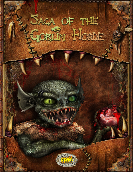
Despite my issues with the size, I'm really pleased with the cover. I've mentioned in the past that I consider the cover the most important piece of artwork, and I think the cover for Saga of the Goblin Horde really captures the feel of the setting, it was definitely a worthwhile investment.

I'm particularly pleased that I ordered the goblin as a separate image, as that allowed me to use the goblin for custom chapter headers, and also use the cover with different illustrations for other books (such as the archetypes).

I wish I'd ordered a custom spine as well though, that would have been awesome for print-on-demand! Or better still, a wraparound cover instead of a separate front and back.

Start Small and Drip-Feed

Creating an entire setting is a pretty big task, particularly if you're working alone, and it can be overwhelming when you first get started. There's also the risk that nobody else will be interested in the setting - and if that's the case, it's better to find out sooner rather than later.

I found the best way to test the waters is to start with something small, like a One Sheet adventure. If it's well received, release a few more adventures, along with some character archetypes. This allows you to incorporate feedback into the setting while you're still designing it, and also helps build up interest by keeping the setting in the public eye. And of course, once the setting is finished, you'll already have a selection of adventures and characters for people to use in their games.

The approach I used for Saga of the Goblin Horde was to release one character archetype per month, until I'd finished all 15. I also released 9 One Sheet adventures, some of them seasonal (Christmas, Halloween and Easter), and others more generic.

Retroactive World Building

Saga of the Goblin Horde started with a One Sheet, and I expanded it from there with more One Sheets and a growing selection of archetypes. It was an effective approach, allowing me to start out small and gradually flesh out the world and setting - but I ran into trouble when I started creating the map of the goblin territory, because I had to retroactively fit all the adventures and archetypes into it. I actually needed to go back and revise some of my older adventures and archetypes, after I created the map.

I think next time I'll create at least a rough outline of the map in advance, and make sure that I update it as I'm writing the adventures, to ensure they remain consistent with each other.

Playtesting is Essential

I've played and run Savage Worlds for a long time, I've reversed engineered and analyzed the mechanics, I've done a lot of number-crunching, and I've written numerous posts, tools and PDFs to help other game designers better understand the system. But I still needed to playtest (and so do you)!

Even though I was confident about the mechanics of my Edges, Hindrances and setting rules, I still needed to playtest to get a feel for how well they worked together. The playtesting also revealed the need for certain setting rules, such as Meat Shield (needed due to the large number of combatants), Quick Skirmish, and Shenanigans.

Layout Comes Last

I normally finish my documents before I start doing the layout work, otherwise even a small change can add a lot of additional effort. However the submission process for Savage Worlds licensee applicants requires the use of representative art, trade dress, and layout, so I transferred my document to Scribus at a fairly early phase, and continued to update it directly in Scribus while I waited for an response. That took ten weeks. By that point I couldn't be bothered to transfer everything back, so I just carried on working in Scribus.

Working in Scribus was a pain in the neck, and I definitely won't do that again. In future I will stick with Open Office until the document is finished and has been through proofreading, and only then will I transfer it to Scribus for the layout.

Networking is Vital

I didn't really start networking with Savage Worlds licensees until I got into freelancing, but over the last year or so I've starting making connections with a lot more game designers, and it's proven extremely beneficial - not just for getting advice and bouncing ideas around, but also for promotion and marketing (something I'm not very good at myself).

Read Books

One of the reasons Saga of the Goblin Horde took so long was that I was learning design skills at the same time (often using side projects to experiment). I spent months blundering through the layout work on my own before Eric Simon recommended reading the Non-Designer's Design Book, and I wish I'd known about it earlier, as it would have saved me a lot of time and effort.

Know your Limits

Most people are better at some things that others, and very few people can do everything. My specialty is game mechanics, but I've also written quite a few adventures, and of course I taught myself how to do layout work. But when it comes to artwork, I'm a lost cause. I wasted a lot of time trying to draw my own maps, instead of hiring a professional (which I eventually did). I'm all in favor of learning new skills, but at some point you have to cut your losses and move on.

Artwork is Addictive

I got a bit carried away with all the stock art when I was working on Saga of the Goblin Horde, I bought a lot more than I needed, often purchasing on a whim. Eventually I learned to discipline myself, adding things to my wishlist for future reference if they took my fancy, and only buying art if I was sure I needed it.

Although I only had three private commissions, they gave me the same addictive feeling, and I've seen other setting designers fall into the same trap - ordering more and more artwork, before they've even got a product for it! This is a dangerous trap to fall into, particularly if you can't afford to write off the cost of the artwork. You might never finish your setting book, or you might not be able to license it. Even if you do manage to commercialize your setting, you might not make enough sales to recoup your costs. I suspect this risk is one of the big reasons why so many people use Kickstarter to fund their artwork, as it ensures they will at least break even.

Summary

Saga of the Goblin Horde has been an interesting project, and it's had its ups and downs, but I feel I've learned a lot, and it's certainly given me a much greater appreciation for the amount of effort that goes into designing a setting. I also feel more confident in my design skills now, and I already have several new projects planned.

Of course there's always more to learn. I'm currently experimenting with print-on-demand services, as I'd like a physical copy of my book! I'll leave that subject for a future post though.

Monday, 8 May 2017

Designing your own Savage Worlds Setting

I've released well over 30 PDFs in the last five years, most of them for Savage Worlds, but my early products had pretty crude trade dress - they were just exported Word documents, and used free low-resolution artwork.

Back in October 2015 I decided it was time to step up my game, as my plan is to eventually move into self-publishing. I started researching how to design a setting book, and recorded my findings in a series of 20 blog posts.

Originally I provided links to these blog posts on the Pinnacle forums, but the forums have been down for quite a while now, and not all of my recent work is specific to Savage Worlds so I figured it made sense to post a new summary here for easier reference.


In my first post on setting design I describe the process I use for creating fan supplements, and discuss the importance of content, layout design, font selection, cover and interior design, title and logo, and artwork.


This post takes a look at the layout of three of Pinnacle's newer settings (ETU, Lankhmar, and Rippers Resurrected). I provide a breakdown of the different sections in each book, showing how many pages are allocated to each section.


I provide some rough guidelines for which chapters and sections should be included in a setting book, along with an approximate word count range for each section.


An anonymous pricing comparison of 100 randomly selected Savage Worlds PDFs, with a brief look at the pricing used by Pinnacle.


Some thoughts about designing Plot Point Campaigns, and the difference between Plot Point Episodes and Savage Tales. I also discuss how to create a Plot Point Campaign by reverse engineering a TV show, and provide an example.


A comparison of Plot Point Episodes, Savage Tales and One Sheets, showing how (if you break it down) a Plot Point Campaign is really just a collection of One Sheets; if you can write a One Sheet, you can write a Plot Point Campaign.


My third blog post about designing Plot Point Campaigns. This time I talk about choosing the overarching plot, and using it to build a Plot Point Summary. I've also included a detailed example for Drakonheim, showing how I might weave three threads into a central plot, and then break the story down into 10 Plot Point Episodes.


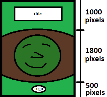
I briefly discuss the importance of having a good cover, and give an overview of how I went about getting my rough cover concept turned into a reality.


I talk about applying the CRAP Principle (Contrast, Repetition, Alignment and Proximity), and provide some suggestions for improving typography.


A detailed description of the process I use for writing One Sheets (which are essentially much the same thing as Savage Tales and Plot Point Episodes).


I show each step of the process as I transform a one-paragraph adventure overview into a second episode for my fictitious "Prophecy of Drakonheim" Plot Point Campaign.


I discuss the importance of geography, topography, and a good map, and share some thoughts about designing a smaller gazetteer based on the mini-setting concept.


I take a step back from my Saga of the Goblin Horde setting, to consider where it came from, where it stands, and where it might go next.


I discuss a mechanism for grid-based travel, with Savage Tales triggered by points of interest, combined with Plot Point Episodes based on the overarching storyline.


I take a look at the different styles and file formats for the Wild Card symbol, comparing the approach used in various setting books, and discussing their pros and cons.


Some musings on creating a gear chapter with multiple item illustrations, and how best to present the layout.


How to create a nicely illustrated bestiary without breaking the bank, with a look at different sources of inspiration, keeping the layout easy to read, and making the bestiary a source of adventure seeds.


A first-hand look at how a setting can evolve throughout the design process, particularly when it isn't fully fleshed-out in advance.


Many game settings include a world map, but a map isn't just aesthetic, it's also functional - in fact it's often one of the most important pieces of artwork in the book, referenced extensively throughout a campaign. But what sort of thought process goes into the creation of a map?


Before I release something there are a lot of things to double-check. In the past I would frequently have to make multiple releases to correct stuff I'd forgotten, but over time I've built up a checklist of things to look out for.

EDIT: Since writing this list, I've added a few more articles!

21. Setting Design: Post-Mortem and Lessons Learned

Now that I've finally finished and released the Saga of the Goblin Horde setting, I decided to take a look back over it, and think about the lessons I've learned.

22. Building a fanbase on DriveThruRPG

Once you've designed your setting you'll need some way to build up interest, attract a fanbase, and eventually sell your products. One of the easiest places to do this is DriveThruRPG, and you don't need to wait until your setting is finished before you start using it!

23. Creating a print-ready PDF

I describe the process I use for creating print-ready PDFs, intended for print-on-demand.

24. Commission artwork: Describing what you want

When commissioning custom artwork, it's important you give the artist enough information to bring your ideas to life. Here's how I went about it.

25. Saga of the Goblin Horde: Silver ENnie Award!

Once you've finished and published your setting, why not submit it to the ENnies?

26. Designing and Selling Custom Decks of Cards

In this blog post, I take a look at the process of designing, printing and selling your own deck of cards through OBS.

27. Savage Worlds Licensing: Ace, Fan or SWAG?

I take a look at the Savage Worlds Adventurer’s Guild (SWAG), and compare it with the fan and Ace licenses.

28. Savage Worlds: Pricing your SWAG

A comparison of the prices used for various SWAG products, my thoughts on different sales strategies, and a look at DTRPG's Best Seller medals and Hottest lists.

29. Customizing Stock Art

When publishing your own setting, the choice is usually stock art (which may not match your needs) or commissioned art (which is expensive). But you also have a third option, if you're willing to invest the time -- you can customize stock art to fit your needs.

Monday, 3 April 2017

Setting Design: Pre-Publication Checklist

I've talked a lot in previous blog posts about setting design, and I've described the process I use to go from initial idea to final product, but before I release something there are a lot of things to double-check. In the past I would frequently have to make multiple releases to correct stuff I'd forgotten, but over time I've built up a checklist of things to look out for, so I thought I'd share it.

Note that if you're preparing your PDF for print-on-demand, you will have to follow additional steps, such as using a specific export format, setting the bleed, checking the colors, and so on. This isn't something I've done (yet), so for the time being I'm focusing on PDFs for use on a screen or for home printing.

Vertical Rhythm

Often considered one of the more important typography practices, vertical rhythm refers to the vertical spacing between elements, and generally requires the use of a baseline grid. This automatically aligns the text across columns, using the principle of repetition to produce a more balanced and readable layout.

If you're using Scribus, click "File", "Document Setup" and "Guides", and you'll see "Baseline Settings" at the bottom.

In the following example, you can see that I didn't use a baseline grid, and the text in the two columns is not correctly aligned:


In the next example I've used a baseline grid, and the text aligns up, giving it a cleaner and more consistent look:


This should really be done when you first set up the document template, but it's always worth double-checking the vertical rhythm before you release a product, particularly if you're not using the baseline grid for your artwork.

Widows and Orphans

Widows and orphans refer to the single lines that sometimes appear on a separate column from the rest of a paragraph, either because the paragraph started at the end of a previous column, or because it was just a bit too long to fit onto one column.

They can be addressed in a number of ways (adjusting the scaling, the margins, the spacing, etc), but I usually edit and rephrase the text to make it fit. This is one of the big benefits of doing my own layout - I can also change the content of the document when necessary, in order to improve the layout.

Spelling and Grammar

It should go without saying that the document should always be checked for spelling and grammar, but it's surprising how often I see simple mistakes make their way into published products. It's also important to decide which language you're going to use - Pinnacle favor American English, for example, so I've made an effort to use American English in my newer products, rather than my native British English. In general either are fine, but it's important you're consistent and don't mix them.

Punctuation

This isn't as easy to check as spelling and grammar, and once again the rules vary depending on which version of English you're using (e.g., whether commas and periods go inside or outside quotes). There are also some stylistic choices to consider, for example Savage Worlds products prefer to use the en-dash instead of a hyphen in front of numbers.

You should also make sure you're using curly rather than straight quotes and apostrophes (unless you're using them to represent feet and inches).

Proofreading

Some mistakes will always need to be caught the old fashioned way. Of course it's far better to have someone else proofread your document, but you should still proofread it yourself as well. You'll need to do this a few times - it's not much fun, but it is necessary if you want to release a quality product.

Copyright Notices and Credits

It's important to double check that all copyright notices and legal disclaimers are in place, and that you've added all of the appropriate credits (and logos). For example if you're writing a One Sheet, and you initially copied the template from a previous One Sheet, you'll probably be using different artwork - so don't forget to update the credits accordingly.

Indentation

Paragraphs should have a first-line indent, but it shouldn't be too large. I prefer to give the text an indent equal to its font point size (typically 10 pt). Don't do this manually, though! You should have defined the indent as part of the style (in Scribus click "Edit" then "Styles").

However you shouldn't indent the first paragraph of a chapter or section. This is another rule that a lot of people ignore, but it's the approach recommended by Robert Bringhurst in his book Elements of Typographic Style.

Statblock Analyser

Characters in Savage Worlds have fairly short statblocks, yet it's surprising just how often people make mistakes. This is particularly common with archetypes, where all of the attribute and skill points have to add up correctly (even a couple of the archetypes in Savage Worlds Deluxe have mistakes), but NPCs often have problems too, with Parry and Tougness being the most common culprits.

Reviewing statblocks is pretty mind-numbing work though, so I put together a tool to analyze them for me. Now I just have to run my statblocks through the tool before publication, and it automatically checks for obvious mistakes.

You can access my statblock analyzer here.

EDIT: There is now a SWADE version of the statblock analyzer here.

Bookmarks

Scribus allows you to specify if a text frame should be used as a bookmark, however this isn't a very convenient approach, because it uses the entire text. If you want to use bookmarks throughout your PDF, you will need to create an additional text frame for each bookmark, and make them invisible. Make sure you also put them on the lowest layer, otherwise some PDF viewers will display them anyway, even if they're invisible.

You may also need to manually reorder the bookmarks, but this isn't particularly difficult. However it's probably easier to leave the bookmarks until the rest of the book is finished.

Update: I've found a better way to handle bookmarks. Add a text frame for each bookmark at the top of the appropriate page and set them as bookmarks as usual (by right clicking on each text field and selecting "Is PDF Bookmark" under "PDF Options", and checking "Include Bookmarks" in the "Save as PDF" dialog), but instead of fiddling around with layers, just right click the text frames containing the bookmarks, select "Properties", and press the "Enable or disable exporting of the object" button so that exporting is disabled.


Text Frame Sequence

Have you ever tried to copy and paste text from a PDF, only to discover that the text was copied out of order? Or perhaps you're using some sort of audio reader, and the speech doesn't appear to follow the sequence that the text appears on the page? That's because the text frames are out of sequence, often because they've been copied and pasted during the layout work.

This can be fixed in Scribus by right-clicking on a text frame, selecting "Properties", and adjusting the level, as shown below:


I find it's usually easier to generate a PDF first, and use it to check the order, then go back and fix it before generating another PDF.

Embedded Fonts

Scribus doesn't automatically embed the fonts, you have to tell it which ones you're using. This is very easy to check, but it's important you don't forget this step, otherwise the PDF may look okay for you (so just looking at the PDF won't necessarily reveal the problem), but the missing fonts will look weird to other people.


There seems to be a bit of a strange bug in Scribus whereby embedding the font isn't recognized as a file change for the purposes of saving. So it's always worth double-checking that the fonts are there, even if you've embedded them previously.

Image Resolution

PDFs can get quite large, particularly if they have a lot of artwork, so it's worth setting the image resolution to the appropriate DPI. Personally I prefer 150 DPI to keep the size down, but 300 DPI is preferable for printing (and if you explicitly want to offer the PDF for printing, don't forget to set the output for print rather than screen).


Layers

It's well worth using layers in your PDF (this option can be set in the same dialog as the image resolution, just make sure you're using PDF 1.5), as this allows the user to switch off different layers for printing - for example they could switch off the background, or the artwork.

However you have to specify which layer each component uses, and mistakes can happen, so after you've created your PDF make sure you check that everything is on the correct layer. I usually do this by zooming out, and checking one layer at a time.

Scribus Workaround

There is a bug with the layers in Scribus, whereby all layers are always displayed when you print the document (you can see this in the print preview as well). So for example, you can switch off the background layer (so that it appears white), but when you print it'll still print the background image.

This can be fixed by opening the PDF with Notepad++, deleting every line that begins with "/usage", then saving and closing the file. After that you need to open the PDF in Acrobat, then immediately close it again, whereby it will prompt you to save (do so). There's a more detailed guide to applying the fix here.

Proofreading (again)

By this point you're probably sick of proofreading. But do it again anyway, and get someone else to proofread for you as well, because there will probably be something you missed (particularly if you made some last minute edits).

You should also check for things like the title and author of the PDF (right click on the PDF in Acrobat Reader, click "Properties", and check the Description tab), make sure the settings in the Security tab are correct, double-check the fonts, and so on.