Monday, 30 May 2016

Saga of the Goblin Horde: Goblin Pyromancer

Although my plan is to eventually move the Saga of the Goblin Horde archetypes into a primer (along with an overview of the setting and a preview of the new mechanics), I've run a bit short on time again this month. However I didn't want to miss my goal of one archetype per month, so here's the sixth archetype: the goblin pyromancer!

As always, you can download all the archetypes here, and don't forget to check out the One Sheets if you haven't already: Sanguine Solstice, Bone of Contention, and Egg Hunt.

I'm also planning a fourth One Sheet for Halloween, which I'm calling Samhain Surprise, but I'll need to keep most of my adventure ideas for the full setting book, as Plot Point Campaigns require a lot of adventures!

Friday, 20 May 2016

Gray Matter: One Sheet for Drakonheim

Last month I discussed how to go about designing a Plot Point Campaign based on a roleplaying setting, and used a fictitious Drakonheim Plot Point Campaign as an example. My blog post was even mentioned by Ron, Kristian and Clint on Simply Savage: Episode 006 – You Down with PPC? (Yeah, You Know Me), which was quite an honor!

The Kickstarter for the upcoming Savage Worlds Drakonheim Companion is rapidly approaching (you can sign up for notifications about it here), so this week I decided it might be fun to turn the first episode of my fictitious Plot Point Campaign into a Savage Worlds One Sheet.

You can download it from here: Gray Matter

The title of the One Sheet has a double meaning: the antagonist is believed to be an intelligent undead (he uses his "gray matter"), and the adventure itself concerns a "matter" for the "Gray" Society.

This is actually my fifth One Sheet, but this time I wanted to try something a bit different.

My other One Sheets are all very linear and "crunchy", using a lot of mechanics. This approach works very well (interestingly enough, I've found such adventures can even be played without a GM!), however I wanted to practice writing other styles of adventure as well, so this time I've tried the opposite extreme; Gray Matter is very "fluffy" and deliberately vague, giving suggestions rather than specifics, so that each GM can run it differently. There are also multiple endings (a concept I first toyed with in Dark Queen's Gambit), so the players can't ruin the surprise by reading the One Sheet.

Because it's also the pilot episode in my fictitious Prophecy of Drakonheim Plot Point Campaign, I also wanted Gray Matter to serve as an introduction to the setting, so it references over a dozen major NPCs as well as various minor NPCs from the setting, along with many of the locations and political factions.

You will obviously need the Drakonheim: City of Bones setting book to run this One Sheet adventure as written.

Friday, 13 May 2016

Savage Drakonheim Preview 1: Necromancy

Back in March I wrote a post about the Savage Worlds Drakonheim Companion, which I'd written for Sneak Attack Press. What I didn't mention at the time was that I'd also converted their Heroes of Drakonheim prequel adventure to Savage Worlds - or more accurately, I'd converted the flavor of the adventure. The underlying mechanics underwent a major rewrite, as I tied in the rules for Chases, Social Conflicts, and even a Mass Battle, as well as adding some FFF rules for the dungeon crawl in the first chapter, and a hexcrawl system for the final chapter.

While both documents are complete and have been through editing, they still need artwork. The companion is around 14K words while the adventure is about 25K words, so the two books will require quite a lot of art in order to look good. Sneak Attack Press have therefore decided to run a short Kickstarter campaign to fund the artwork.

In the lead-up to the Kickstarter, they're also releasing some previews, and the first covers necromancy, including two of the new Hindrances (Charnel Taint and Morbid Obsession) and three Edges (Channel the Dead, Gray Adept and Spectral Ritualist), as well as a look at the rules for Sentient Undead.


But while I'm on the subject, I thought I'd also take this opportunity to talk a bit about some of the behind-the-scenes design ideas.

Skeletons are Really Just Zombies in Flesh Suits

The skeleton in the Savage Worlds bestiary is described as a zombie that has rotted away, however it has better stats (Pace 7 instead of 4, and +1 Agility) and loses the weakness to headshots. This raises two questions: First, why would necromancers bother using zombies instead of skeletons if the latter are superior? And second, why is the zombie vulnerable to headshots if it can survive its brain rotting away entirely?

This seems to be a bit of a genre mixup, as horror movies often have zombies that can be killed by destroying their brain. But I wanted to use the Savage Worlds Deluxe stat blocks for both types of undead, so I came up with a way to justify the discrepancy.

By default the zombie power infuses the flesh and brain with necromantic energy. This is why a zombie is vulnerable to headshots (the brain is still important). However Gray Society necromancers can spend an additional +1 PP to infuse the bones as well - the resulting undead can then be stripped of flesh (becoming a faster skeleton) or left as a "fast zombie" that isn't vulnerable to headshots.

Liches are Really Just Smart Skeletons

I've seen a number of discussions from people wanting playable liches in Savage Worlds, and if any setting deserves to have such rules, it's Drakonheim. However I wanted the rules to feel like a natural extension of undead creation, almost a side-effect, rather than as something separate bolted onto the side.

I decided to approach liches with a Gray Society secret ritual called the Rite of Dark Transcendence. Performing this ritual allows the creation of permanent undead, and if you kill the victim while using the ritual on them rather than just casting the spell on their corpse, they have a (very slim) chance of retaining their intelligence and independence. This would cover the rare cases of skeletal champions, zombie lords, and so on.

However in combination with Soul Store (a new Legendary Edge), necromancers have a much better chance of surviving the ritual intact, and the result would be very much like a traditional lich - particularly if they take the Enervating Conduit Edge as well. This concept also ties in with my observations about Immortality and the Price of Death.

There is no explicit "lich" ability, in fact I don't use the word "lich" anywhere in the document. But if you read between the lines, it soon becomes very obvious that a skilled necromancer can become a lich by combining several of the new necromantic Edges. If they want to call themselves a "lich" or a "death knight" or whatever else, then that's their business!

Permanent Undead

Animated undead in D&D are permanent until destroyed, and as the Drakonheim adventure was originally written for D&D, permanent undead are an important part of the setting. But in Savage Worlds, the zombie power only lasts for 1 hour, or d6 hours on a raise, or a full day on two raises. That's simply too short for Drakonheim - and even if we'd used the Necromancer Edge from the Horror Companion, it would still be extremely difficult to raise an army of permanent undead.

But how powerful is a permanent undead, really? If provided with weapons and armor, they're a bit better than a standard soldier, but not by much. The Gray Society didn't make a difference to the defense of the city because its undead were powerful, it made a difference because there just weren't enough living troops to man the walls. If there had been a mercenary company nearby, someone with Filthy Rich could just have hired them instead, with the added bonus of avoiding the social fallout that resulted from the use of undead.

So I decided to approach the problem from that perspective - instead of paying money for a mercenary, you pay money for spell components which are used to make the undead permanent. Then it's just a matter of working out the price.

During character creation you start with $500, and can triple that amount for 2 points (the same as an Edge), or by taking the Rich Edge. So although I would never allow someone to simply purchase Edges with cash, as a very rough guideline for balancing purposes one could argue that an Edge is worth approximately $1000.

The Followers Edge grants 5 minions, and you can take soldiers if you like, so one might extrapolate that a soldier is worth $200. Note that while Followers is a Legendary Edge, Legendary Edges are not usually any stronger than other Edges, their main advantage is that their benefits stack.

But to come back to undead: I decided to set the cost at $100 per PP. That means a permanent zombie costs $300, while a permanent skeleton costs $400. That's more expensive than might be suggested by the Followers Edge, but still quite affordable. It also explains why the Gray Society use both zombies and skeletons; the former are cheaper, but if a body has rotted too much then the more expensive ritual is necessary.

Controlling Undead

I also placed limits on how many undead can be controlled at once - by default it's half your Spirit die, but there are three Edges which double the number (in addition to each providing other necromantic abilities), so if you have all three you can control a number of undead equal to four times your Spirit (which, not coincidentally, is exactly the same number as the Savage Worlds lich).

This does mean a necromancer PC could potentially have their own private army, but that's hardly a unique issue - a character with the Noble Edge can already start with their own small army, just as a character with Filthy Rich can hire one.

This solution also indirectly explains how the city watch are able to control undead and use them in their patrols, which is something they're described as doing in the setting book.

Permanent Wards

The second chapter of the Heroes of Drakonheim adventure has an encounter with a group of undead trapped by a magical ward. While it would probably have been fine to handwave the ward as "a special NPC ability", I personally prefer it when the mechanics are clearly explained and even usable by players.

So in the above encounter, the necromancer obviously had the Spectral Ritualist Edge, and created a ward using the barrier power with a Spectral trapping.

Necromancy Edges and Trappings

When I worked on Guild of Shadows, I ran into the problem of the Thief Edge being a no-brainer (due to its importance in an urban stealth-based setting). I worked around this issue by adding two alternatives, Highwayman and Urban Ranger, so that players wanting that much-coveted +2 Stealth bonus had the choice of three different Professional Edges.

I applied the same sort of reasoning to necromancers in Drakonheim. There are three new necromancy trappings that can be applied to powers: Ectoplasm, Enervation and Spectral.

Each trapping also has its own specialist Edge (Ectoplasmic Sculptor, Enervating Conduit and Spectral Ritualist), representing the three different paths to power a necromancer can take. Although it's obviously possible to mix and match, the Edges each tie in with one of the trappings, and so they tend to encourage specialization.

Summary

Quite a lot of thought went into the design of the Savage Worlds Drakonheim Companion, and I think fans of necromancy will find a lot of useful mechanics for their games, but the companion will be of the most use when combined with the Drakonheim: City of Bones setting book.

But don't forget to take a look at the free necromancy preview, and feel free to share your thoughts and spread the word about the upcoming Kickstarter.

Thursday, 12 May 2016

CRAP Design and Good Typography

Based on an excellent suggestion from +Eric Simon of Four-in-Hand Games, I've recently been reading the Non-Designer's Design Book by Robin Williams (no, not that Robin Williams). It contains a lot of great advice, but one thing I've found particularly enlightening is the "C.R.A.P." principle, which stands for Contrast, Repetition, Alignment and Proximity. This principle is discussed in many places online, but in short it works like this:

  • Contrast: Elements on a page should never be just "similar", they should either have the same style or be very different.
  • Repetition: Using the same style throughout the document gives it a feeling of consistency and cohesion.
  • Alignment: All elements on the page should be visually connected to each other.
  • Proximity: Related elements should be grouped together.

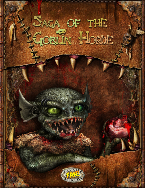
Now that I have a new cover for Saga of the Goblin Horde, I'd like to update my earlier releases to use the same style, so I figured this might be a good opportunity to apply what I've learned so far. I've obviously still got a lot to learn, but I've always learned better through practice, so I decided to have a play around.

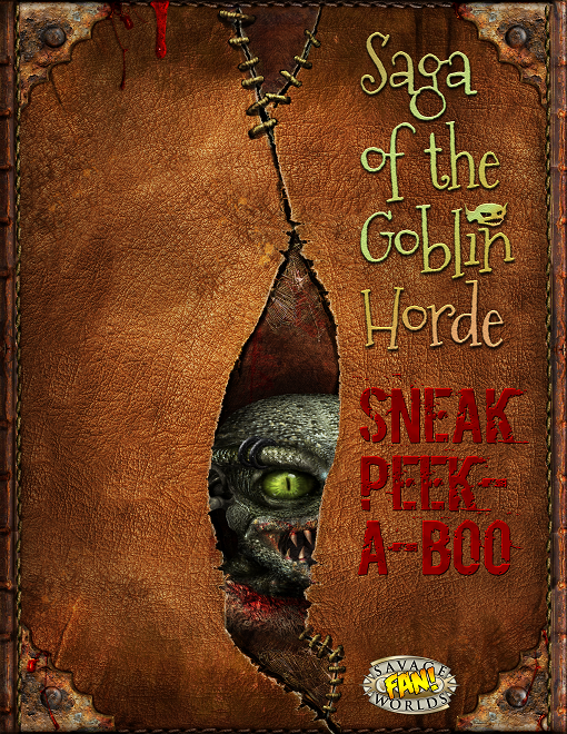
Sneak Peek-a-Boo

Rather than just update the archetypes supplement, I thought it might be worth turning it into a free primer - it would still contain the archetypes, but would also include an overview of the setting and a sneak preview of some of the new mechanics.

But this raised the question of what I should use for the cover. I don't want to use the same cover as the setting book, but neither do I want to commission a second cover. I considered using the front cover with a different goblin illustration, but it would be extremely difficult to find any existing art that matched the same style, and the two covers would still end up having a bit of a "samey" look that I wanted to avoid.

So after some consideration I decided to use the back cover (which I probably wouldn't include in the PDF anyway), and I'm thinking of doing something like the mock-up on the right.

The title font is the same one I've used in my other releases - "Mountain's of Christmas", which is free for commercial use, and I think captures the slightly comical feel I'm aiming for (when I discuss the setting with non-roleplayers, I describe it as "Gremlins meets Lord of the Rings").

Following the rule of contrast from the CRAP principle, the "Sneak Peek-a-boo" text has a completely different color and font to "Saga of the Goblin Horde", although both text elements are placed close together (proximity), and are aligned with each other as well as the logo (alignment).

The placement of the goblin's head also uses the Rule of Thirds as best I could manage, with the eye placed along the bottom grid line. Because of the position of the rip in the center of the page, it's not possible to align the eye with a grid intersection point, but at least it's on a grid line.

The "Sneak Peek-a-boo" text is also aligned with the goblin's eye, and is an amalgamation of "Sneak Peek" and "Peek-a-boo" (which is also why the "Peek-a-boo" is split over two lines) - this is typical of the sort of wordplay I use in Saga of the Goblin Horde.

The goblin's face is also facing slightly towards the text. The intent is that the eye is the first thing to catch the viewer's attention, and that directs them towards the "Sneak Peek-a-boo" text.

Normally I would have placed the "Saga of the Goblin Horde" on the left, but one thing the Non-Designer's Design Book discusses is that you shouldn't be afraid of empty space. It would also be difficult to align it with the "Sneak Peek-a-boo" text horizontally.

Repetition and Typography

I decided it would also make sense to update my One Sheets to the new style, and I wanted to apply some improvements to the typography, which is another subject I've been reading up on, and which +Marcelo Paschoalin has also been giving me some advice about.


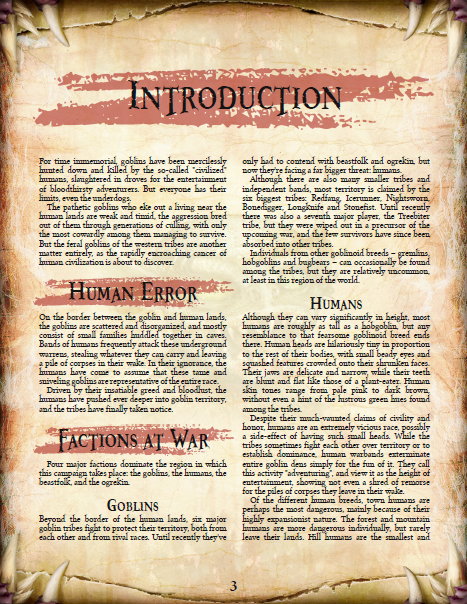
Now that I've got a custom cover and interior page design for Saga of the Goblin Horde, I thought it would make sense to redesign my One Sheets in the same style - not only to make them consistent with the setting, but also to correct some typography mistakes I've been making.

As you can see from the about comparison, I've changed to the new paper design, updated the banner to use the same texture as the cover, given it a more subtle drop shadow, added the goblin head as a logo, and redone the title to match the cover.

The goblin illustration by the talented +Rick Hershey has been recolored (because the goblins in Saga of the Goblin Horde are always green), the body font has been changed to Crimson (which I prefer to the previous Open Sans), and the subheadings now use the narrower Booter Zero Zero font, rather than Booter Five Zero.

I've also made a few corrections to the typography (you can compare the numbers with the screenshot on the right):
  1. The text rows are now aligned across the columns (see here).
  2. The first paragraph after each subheading is flush left, instead of being indented (see here).
  3. Removed the space between paragraphs, as it's not needed if you also indent (see here).
Note: Although you can't see it on these screenshots, I've also started using a custom "goblin head" Wild Card symbol for the NPCs; personally I think all settings should have their own special Wild Card symbol :)

Summary

No doubt I'm still making plenty of mistakes, and it wouldn't surprise me if I go back and redo all of this a few months from now, but the important thing is that I'm learning and improving. I personally feel that the quality of my supplements has noticeably improved over the last year, and I hope to keep improving them in the future.

If nothing else, I've certainly gained a hefty appreciation for the hard work of professional layout designers!

Wednesday, 4 May 2016

The King is Dead: VARGR

My first foray into freelancing for Savage Worlds licensees was Savage Archery, an article I wrote for Savage Insider volume 2 issue 2. One of the other articles in the publication was by returning author Sean Bircher, who had already written for the previous issue, and also ran the popular blog Wine and Savages. We both went on to write again for Savage Insider, and then started writing for other licencees.

Our paths converged again recently with Accursed, where Sean wrote the Outlands half of Bone and Barrow, while I wrote a One Sheet set in the Outlands. It was great to see how well he's done for himself, and compare the different things we've worked on since Savage Insider.

But like me, Sean also has plans for his own setting, and he and Robin English-Bircher have just released their first official licencee adventure for it!

The King is Dead: VARGR

Although this is advertised as an adventure, it's really more like a mini-setting. There's an overview of the history and geography of the region, a recap on recent events, and a breakdown of the various political factions (secret societies), as well as a handful of new abilities (one power, one Edge, and two Hindrances). There are also six archetypes (each offered as two versions: "standard" and "horrid secret").

The setting itself is a bit like a blend of French Revolution, Bram Stoker's Dracula, and Brotherhood of the Wolf, set in an alternate history with heavy gothic overtones and vampire aristocrats. The adventure part is split into three acts, each of which spans two pages, and I'm pleased to see it makes extensive use of Savage Worlds mechanics like Chases and Dramatic Tasks.

Overall this is a very cool product that offers us a taste of great things to come. Check it out!


Sunday, 1 May 2016

Saga of the Goblin Horde: Custom Cover

I've written about presentation and supplement design in the past, and I've been applying those concepts to my new releases (such as the updated Savage Frost GiantsEldritch Weapons, etc).

However until now I've only used stock art - and while stock art can often be very good, it's not unique. For interior artwork this isn't such an issue (in fact even most Savage Worlds licencees use stock art to at least some extent), but I really think it's important to have a unique front cover.

So recently I decided to commission my first piece of custom work, a cover (front and back) and interior page design for my upcoming Saga of the Goblin Horde setting.

While there are a lot of talented artists in the RPG community, when it comes to covers, my favorite is Lord Zsezse Works. They sell a wide range of Template Packs, and I've been using those in most of my recent Savage Worlds supplements, but they also offer custom-made covers.

I requested a cover with blades and blood-splatters, a color-scheme that would fit with a parchment-style interior paper design, enough space for a logo at the bottom and the title at the top, and a layered effect for the top and bottom, with a goblin portrait in the center.

I included a very rough sketch of what I had in mind, but said it was just a guideline and that I trusted their judgement, as they clearly know what works and what doesn't (and, as can be seen from my rough sketch, I'm no artist!)

They kept me updated as they progressed to make sure I was happy with the direction it was taking, and to see if I needed anything changing, and today I received the final version (as you can see from the screenshots in this post)

I'm really pleased with the results, I think the cover does a great job of capturing the feel of the setting!